The retail team has worked with Mick and Brita for over ten years, from the launch of their bestselling children’s book, William Shakespeare: Scenes from the Life of the World's Greatest Writer, to developing our exclusive Will Shakespeare range and beautiful babywear collection.
Adam Sherratt asks Mick and Brita about reimagining Anne for the new retail range.
We don't know what Anne Hathaway looked like - the earliest depiction is a 1708 sketch by Nathaniel Curzon in a copy of the Third Folio, labelled as 'Shakespeare's consort' - so how do you go about creating a portrait of her?
Mick: Well, as historians don’t really know for sure what she looked like, we felt we had some freedom to interpret and imagine. Of course, we did look at the Curzon portrait and the Roger Brien Dunn recreation in the Trust’s collection. However, we were also inspired by the wonderful portraits of near-contemporary women by Holbein. His portraits are breathtaking historical records although perhaps a little passive for our imagined Anne Hathaway.
So how did you imagine Anne? I'm guessing Maggie O'Farrell's portrayal of her in Hamnet as a figure deeply connected to nature - and a falconer too - was a gift for you?
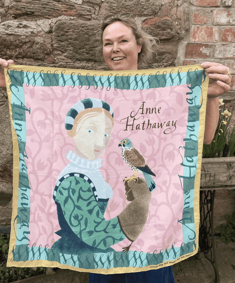
Brita: Yes, O’Farrell’s portrait of ‘Agnes’ was very inspiring, and we felt that her inspired symbolism of the falcon dove-tailed very well with the Anne Hathaway we had originally imagined when we made our book William Shakespeare: Scenes from the Life of the World's Greatest Writer. As the design was commissioned as part of the Trust’s ‘The Women who made Shakespeare’ celebrations, we wanted our image of Anne to be enigmatic; a strong woman in her own right, a woman with her own passions and desires, beyond being pigeon-holed as Shakespeare’s wife. The symbolism of the leather glove holding the fierce little falcon helps us get that across.
And what do you hope people will see in her?
Brita: That they will feel they are looking into the eyes of a steadfast determined young woman.
We shared Roger Brien Dunn's modern portrait from our own collection, which is based on Nathaniel Curzon's drawing, and you mentioned Holbein, but were there any other sources you looked at or paintings that inspired you?
Mick: Well, yes we did. As we knew we were going to make the artwork using stippled pochoir, a stencil technique, we looked closely at one of our own heroes, the 18th-century master printmaker, Francesco Bartolozzi. He is perhaps best known for his use of making stippled etchings known as the ‘crayon manner’ and particularly for his interpretations of the Holbein portraits. Bartolozzi was so successful that he had a huge team of printmakers working for him in his ‘print factory’ in Fulham. In fact, one of my ancestors may have worked with him for a time, which certainly adds to my fascination with him.
Did your idea of Anne influence your use of colours and pattern?
Brita: The fashions of the day were inspiring to us both. Her connection with nature and ruralism is shown in her green bodice and sleeves and the kestrel on the suede glove. You could say she is something of a midsummer night’s dream. Was the glove made for her by Will’s father? Let’s pretend it was.
The Will Shakespeare character you created for our range of children’s merchandise was developed from your illustrations in William Shakespeare: Scenes from the Life of the World's Greatest Writer, and you've also illustrated Anne for us before, but this portrait feels more sophisticated and more closely aligned to your own work as practising artists.
Mick: Yes, the Will Shakespeare character for the merchandise grew out of our children’s book. However, as practising artists and designers, the portrait commission, especially for a scarf aimed at adults, provided an opportunity to make work that made full use of Brita’s talent for painting people and my interest in the pochoir techniques of the mid-twentieth century.
We had made some pochoir images of the Brontë sisters for the Parsonage Museum in my hometown of Haworth some years ago and this felt like a natural progression; and to make a scarf felt super-exciting.
Can you explain more about the pochoir technique?
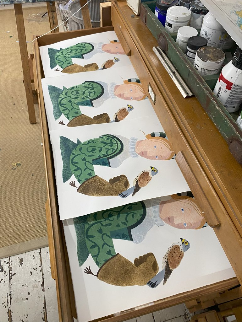
Mick: Pochoir is a French term that alludes to the use of hand-applied stencils to reproduce multiple artworks. People may be misled that pochoir is a form of printmaking. However, while it remains closely allied to reproductive printmaking techniques (in the sense you can make multiple, although non-identical pochoir ‘prints’ from a single set of stencils) they are not technically prints and it is not technically printing as no litho or etching plates are used, only hand, eye and brush. It doesn’t involve any form of pressure either other than a variety of sometimes vigorous, sometimes gentle stipple application. In 1930s Paris, artist production lines used a highly refined form of pochoir to add layers of colour to books and limited-edition prints. Later mid-century illustrators such as Feodor Rojankovsky employed stunning pochoir techniques to illustrate children’s books, such as the series written by Père Castor. I was taught by Sheila Robinson at the RCA who was an expert with pochoir and I have used hand-stippled pochoir in my own work for many years. Not only is pochoir beautiful in its own right, creating textures and random visual delights, but it also echoes the long-departed medium of stone lithography
And could you say something about the process of making the portrait together?
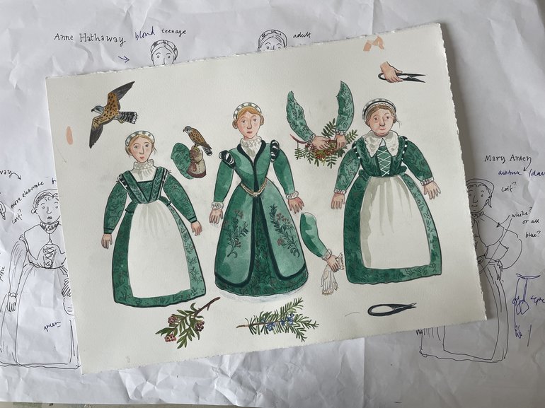
Brita: To make the artwork we both created the rough layout. I drew Anne while Mick drew the kestrel and glove. We then made a combined final linear drawing onto stiff paper which Mick cut into a carefully planned set of stencils. He then layered the applications of colours that I chose and mixed. Sometimes we would achieve a third colour from the planned overlapping of two colours. We loved the collaboration and we are delighted with the result. Can we do Will next please?
The Anne Hathaway collection is available exclusively from our shop at Anne Hathaway’s Cottage and by visiting our online shop.